When someone arrives on your website, the first few seconds are critical. Visitors often decide whether to stay or leave almost instantly, and that decision is shaped by how quickly they understand what you offer. If the purpose of your site isn’t obvious, you risk losing potential customers before they’ve even had a chance to learn more. A well-structured and thoughtfully presented first page can set the tone, answer initial questions, and encourage deeper exploration.
Lead with a Direct Message
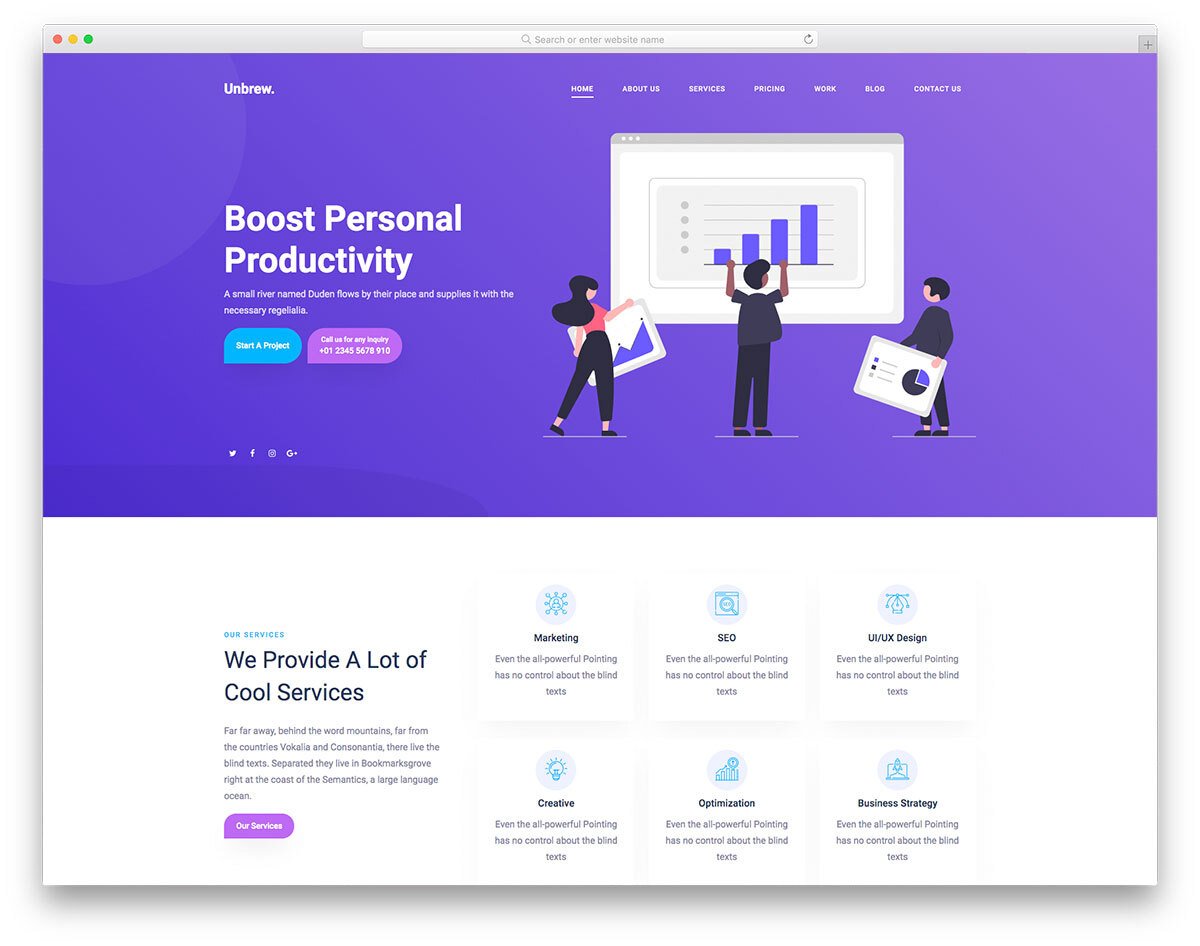
Your main headline should explain your services in straightforward, everyday language. Avoid long, complicated phrases or industry-specific jargon that could confuse someone unfamiliar with your work. Instead, aim for clarity that can be grasped at a glance, even by someone scrolling quickly. This headline should stand out visually so that the visitor’s eye is drawn to it immediately, making it one of the first elements they process when the page loads.
Use Visuals That Reflect Your Work
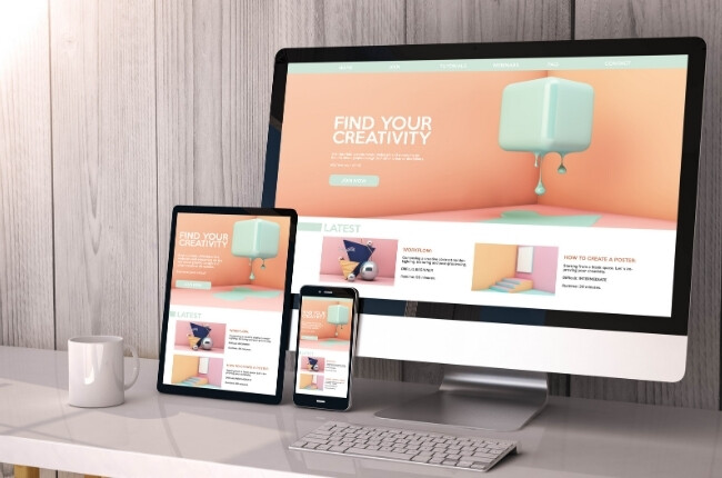
Images and graphics aren’t just decorative—they play an important role in confirming and reinforcing your message. A well-chosen image can communicate what words alone may take longer to explain. For example, if you design websites, showing a polished example of your work is far more impactful than a generic stock photo. Whenever possible, use visuals that are authentic to your business, whether that’s pictures of your team, your workspace, or the products and services you deliver. This helps visitors form a connection with your brand right away.
Organise Information Clearly
The way information is arranged on the first page can make the difference between clarity and confusion. Your most important services should be positioned prominently, with short yet meaningful descriptions that summarise what each one involves. Grouping related services together and using clear section headings allows visitors to scan the page quickly and understand the structure without having to search for key details. This logical flow also encourages them to keep reading, as they can see the information is presented in a way that respects their time.
Guide Visitors to Action
Once a visitor understands what you do, it’s important to make their next step clear and convenient. Whether you want them to fill out a form, request a quote, or book an appointment, this action should be visible and accessible from the first page. Buttons or links should be placed where the eye naturally travels, so there’s no need for the visitor to scroll endlessly to find them. The easier it is to take action, the more likely they are to do so while their interest is fresh.
Keep It Focused
While it may be tempting to include every detail about your services on the first page, too much information can overwhelm visitors. It’s better to provide a concise overview that sparks interest, with links or secondary pages available for those who want to dive deeper. This keeps the first page clean, easy to digest, and focused on its main purpose: clearly presenting what you offer and encouraging further engagement.
A clear, focused first page doesn’t just inform visitors—it makes them feel confident about exploring more of your site. By combining direct messaging, authentic visuals, and logical organisation, you can turn those first few seconds into an opportunity to capture attention and start building a relationship with your audience.